
Ecommerce checkout optimisation means finding where shoppers drop between the product page, the cart and payment, then A/B testing a fix at that exact step.
Map the funnel first with add-to-cart, begin-checkout and purchase events. Then test whatever answers the shopper’s open question: delivery date, total cost, payment options, returns.
Judge tests on revenue per visitor.
Most checkout advice is a list of the same fixes: fewer fields, guest checkout, a progress bar. They are fine. They are also why so many D2C brands run a “best practice” checkout and still lose a large share of shoppers after add to cart.
On a UK fine jewellery brand we worked with, around 60% of shoppers were dropping between adding to cart and completing checkout.
The checkout itself was not the problem. The cart page was failing to answer the questions people have before they spend £700 to £2,000 on a ring.
This article walks the full journey step by step, shows where drop-offs hide, and lists the 6 tests we would run on the product page, cart page and checkout.
Key takeaways
- Find the leaking step before you test anything. Most teams test the checkout when the drop happens on the cart page.
- The most overlooked checkout fix is answering a category-specific question, such as “is this insured in transit?” for jewellery.
- On Shopify, the cart page is where you have the most control. The checkout itself is much harder to change.
- Judge D2C tests on revenue per visitor, not conversion rate. Finance messaging and upsells can move order value as well as orders.
- A test is never finished. Re-run payment, delivery and promo tests whenever your traffic mix or price points change.
What does the ecommerce purchase journey look like, step by step?
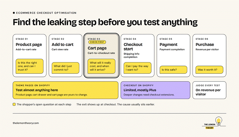
The D2C purchase journey has 6 measurable steps: product view, add to cart, cart view, checkout start, shipping and payment details, and purchase. Each step has its own drop-off rate. Measure all 6 before you test, because the step with the biggest drop is rarely the one the team suspects.
If you run GA4, the recommended ecommerce events already map to this: view_item, add_to_cart, view_cart, begin_checkout, add_shipping_info, add_payment_info and purchase.
| Step | What to measure | The question the shopper is asking | Where to test |
| Product page | Add-to-cart rate | Is this the right one, and can I trust it? | Product page |
| Add to cart | Cart view rate | What did I just commit to? | Cart drawer or cart page |
| Cart page | Cart-to-checkout rate | What will this really cost, and when will it arrive? | Cart page |
| Checkout start | Shipping info completion | Can I pay the way I want to? | Checkout (limited on Shopify) |
| Payment | Payment completion | Is this safe? | Checkout, payment step |
| Purchase | Revenue per visitor | Was it worth it? | Whole journey |
The table matters more than any single test. Once you know the cart-to-checkout rate is the weak step, you stop arguing about button colours on the product page.
Where do D2C shoppers actually drop off?
Shoppers drop where an unanswered question meets a commitment. The add-to-cart click is cheap. The cart page and payment step are where the real cost, delivery time and risk become visible, so they are where hesitation turns into exits. For high-ticket products, that gap is usually wider.
Generic abandonment reasons (unexpected costs, slow delivery, no preferred payment method) show up in most surveys. Baymard Institute publishes research on checkout abandonment reasons that is worth reading. The more useful work is finding the reasons that are specific to your category.
Eg, for jewellery, the questions are concrete. Is the diamond certified? Is delivery insured? What comes in the box? Can I resize it if I’ve guessed the size wrong? For skincare, it might be “will this suit my skin type?” For furniture, “will it fit through my door?” If the product page or cart page does not answer these, the shopper leaves to find the answer somewhere else, and often does not come back.
On Shopify, there is a practical reason to focus here too. The product and cart pages are part of your theme, so you can test almost anything on them.
Changes to the checkout itself are far more restricted, and most of the deeper customisation sits on Shopify Plus. That pushes most of your testing upstream, onto the pages you control.
Which checkout tests do most D2C brands overlook?
The 3 most overlooked tests are answering the category-specific question on the cart page, showing an exact delivery date instead of a range of working days, and giving high-ticket shoppers a human help route. None of them are on the standard checklist, because they depend on what you sell.
1. The category question, answered on the cart page
Control: Cart page shows items, prices and a checkout button.
Variant: Each item carries a short trust line for the category. For a diamond ring: “IGI certified”, “Free, fully insured delivery”, “Free resizing”, and what comes in the box.
Judge it on: Cart-to-checkout rate and revenue per visitor.
2. A delivery date, not a delivery promise
Control: “Delivery in 3 to 5 working days.”
Variant: “Estimated delivery: Fri 22 Aug to Wed 27 Aug. Order within 6 hrs for dispatch today.”
Judge it on: Cart-to-checkout rate. Run it on the product page as a second test.
A date answers “will it arrive before the anniversary?” A range of working days makes the shopper do the maths.
3. A human route for high-ticket carts
Control: No contact options on the cart page.
Variant: A small help block: WhatsApp or call, plus a sizing question link.
Judge it on: Checkout completion and the number of help conversations that end in an order.
The trade-off: someone has to answer those messages quickly. A help link nobody answers within the hour does more harm than no link.
Which checkout tests should you keep re-running?
Keep re-running finance messaging near the total, payment method visibility under the checkout button, and how the promo code field is shown.
Each one shifts with your price points, your traffic sources and the payment options available, so last year’s winner is this year’s hypothesis.
4. Finance messaging near the total
Control: Total price only.
Variant: “From £X/mo over 12 months, 0% APR” directly under the total, with a link to finance options.
Judge it on: Revenue per visitor and average order value, not conversion rate alone.
Only show finance terms you actually offer, worded the way your finance provider and local advertising rules require.
5. Payment methods under the button
Control: “Checkout” button, with PayPal shown on its own below.
Variant: “Secure Checkout” button, followed by the full payment strip: Visa, Mastercard, Amex, PayPal, Apple Pay, Google Pay.
Judge it on: Cart-to-checkout rate and payment completion.
A lone PayPal button can make a store look PayPal-only. Shoppers who don’t use PayPal may never click through to find out.
6. The promo code field
Control: Open promo code box on the cart page.
Variant: Collapsed “Have a promo code?” link that opens the field.
Judge it on: Cart-to-checkout rate and discount spend per order.
An open box tells every shopper a discount exists somewhere. Some will leave to search for it.
What this looks like in practice
The fine jewellery brand above sold lab-grown diamond engagement rings online at roughly £700 to £2,000 per ring. The data showed the leak clearly: around 60% of shoppers dropped after adding to cart, before completing checkout.
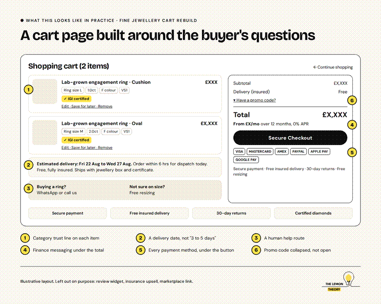
We rebuilt the cart page around one idea: answer the ring buyer’s questions before they reach the checkout button.
Each change answered one question:
- “Is the diamond real?” An IGI certification flag on every item.
- “Will it arrive in time?” An estimated delivery date, with an order-by cut-off for same-day dispatch.
- “Is it safe in transit?” Free, fully insured delivery, stated next to the price.
- “Can I afford this?” Monthly finance terms directly under the total.
- “Can I pay my way?” Every payment method, shown under a “Secure Checkout” button.
- “What if the size is wrong?” Free resizing, plus a WhatsApp line to a real person.
What most people get wrong about checkout testing
The biggest mistake is testing the checkout because that is where the drop-off shows up in the report. The exit happens at checkout. The cause usually sits earlier, on a product page or cart page that never answered the question.
The second is judging on conversion rate. A finance message can lift order value without moving conversion rate. A discount banner can lift conversion while cutting margin. Revenue per visitor catches both.
The third is copying another brand’s checkout. Checklists are a starting point. A low-priced skincare order and a £2,000 ring do not share the same objections, so they should not share the same cart page.
Frequently asked questions
What should I A/B test first on an ecommerce site?
Test the step with the biggest drop-off in your own funnel. Pull add-to-cart rate, cart-to-checkout rate and checkout completion rate, find the weakest step, and test there first.
For most D2C brands that is the cart page, because it is where total cost, delivery time and payment options first become visible.
Can you A/B test the Shopify checkout?
Only partly. The product and cart pages are part of your theme, so you can test most things on them. The checkout itself is locked down, and deeper changes generally need Shopify Plus and checkout extensions.
Check Shopify’s current plan documentation before planning a checkout test, because the rules change.
How do I find where shoppers drop off?
Set up GA4’s recommended ecommerce events: view_item, add_to_cart, view_cart, begin_checkout, add_shipping_info, add_payment_info and purchase.
Build a funnel exploration across them and compare by device and traffic source. The step with the steepest drop is where your first test belongs.
Should I show buy now, pay later on the cart page?
Test it, especially for higher-priced products. Showing a monthly price near the total can make a large order feel manageable. Judge it on revenue per visitor and average order value, and only show terms you actually offer, worded as your finance provider requires.
Should I hide the promo code field?
Often, yes. An open promo code box signals that a discount exists, and some shoppers leave to find one. A collapsed “Have a promo code?” link keeps it available for people who already have a code. Test it and watch discount spend per order as well as conversion.
What is the most overlooked part of checkout optimisation?
The question specific to your category. For jewellery, it is certification, insured delivery and resizing. For other categories it will be something else. Generic checklists can’t tell you this. Your customer service inbox and sales conversations can.
Where to start
Build a 6-step funnel report from your ecommerce events this week. Find the step with the biggest drop. Then pull 20 recent customer service questions and mark which ones the page at that step fails to answer.
That list is your first test plan. If you want us to look at it with you, book a CRO audit. For the paid side of D2C growth, see how a UK D2C jewellery brand reached 4.3× ROAS within 60 days, what our CRO and performance services cover and how we structure a full-funnel strategy.
Khadija Karachiwala is co-founder of The Lemon Theory, where she leads CRO, analytics, email and paid search.
She has an MBA from MICA and previously worked at Builder.ai, Digital Avenues and The Media Ant. She spends a lot of her time asking why shoppers left the cart.